Descalzos Viejos
Rebranding & Label Design
(Personal Project, not commercial)
Wine Label
Olive Jar
CASE STUDY
A closer look at the creative process behind the Descalzos Viejos wine label, from research and concept development to final design execution.
Brief Description
In this immaginary brief, I was tasked with rebranding Descalzos Viejos to appeal to a younger audience. Based in Ronda, Spain, the winery was founded in the late 1990s and mainly produces red wines priced between €10 and €35. The goal was to design a new label that feels fresh while staying true to the brand’s roots.
The expected deliverables:
Refresh or re-create the exsisting brand logo.
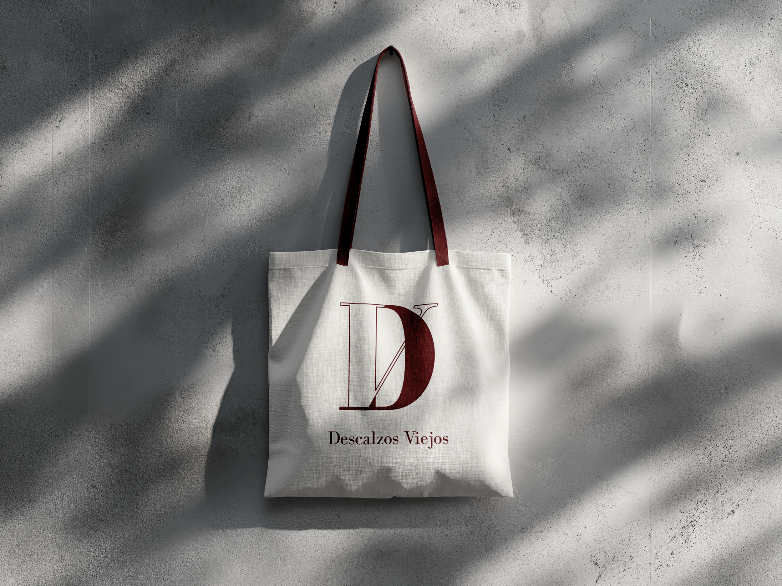
Create Brand collaterals; a business card & tote bag.
Create a bottle label and outer packaging for one wine.
The packaging for one other complementary and traditional Andalusian Food.
Inspirations
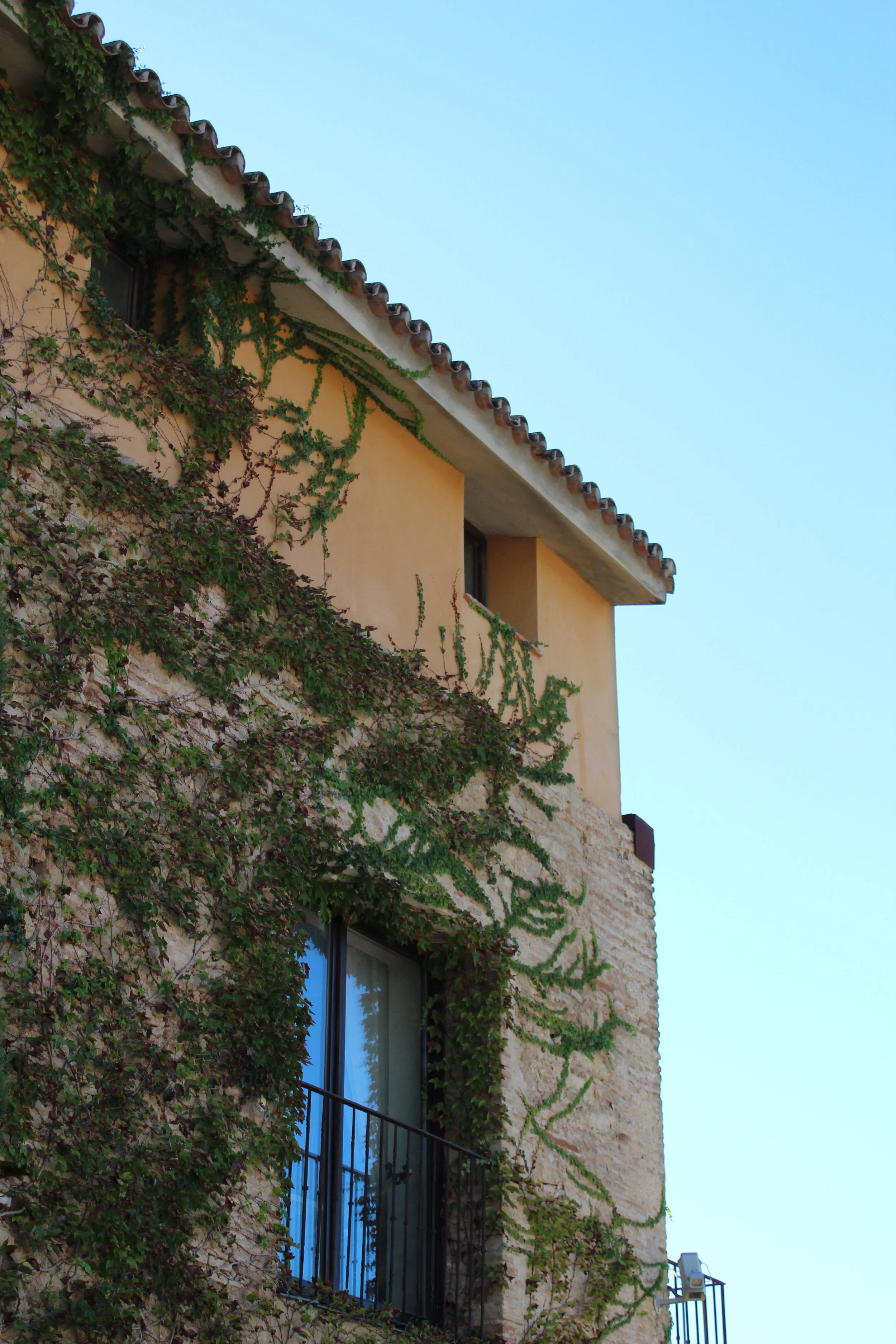
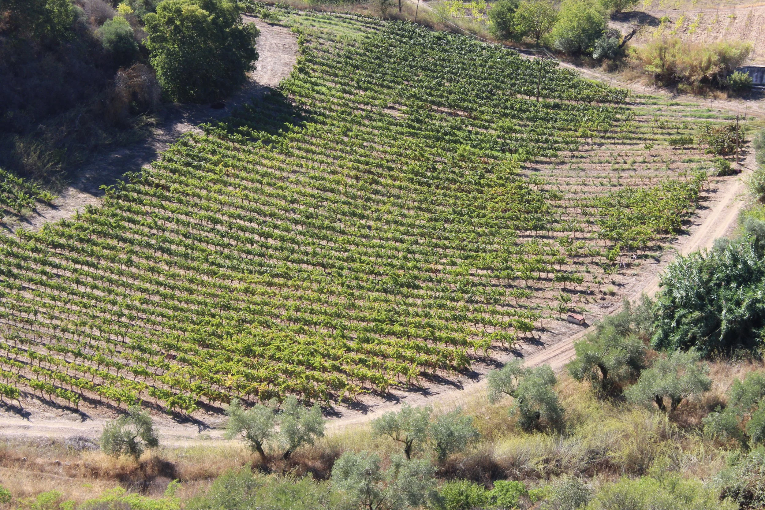
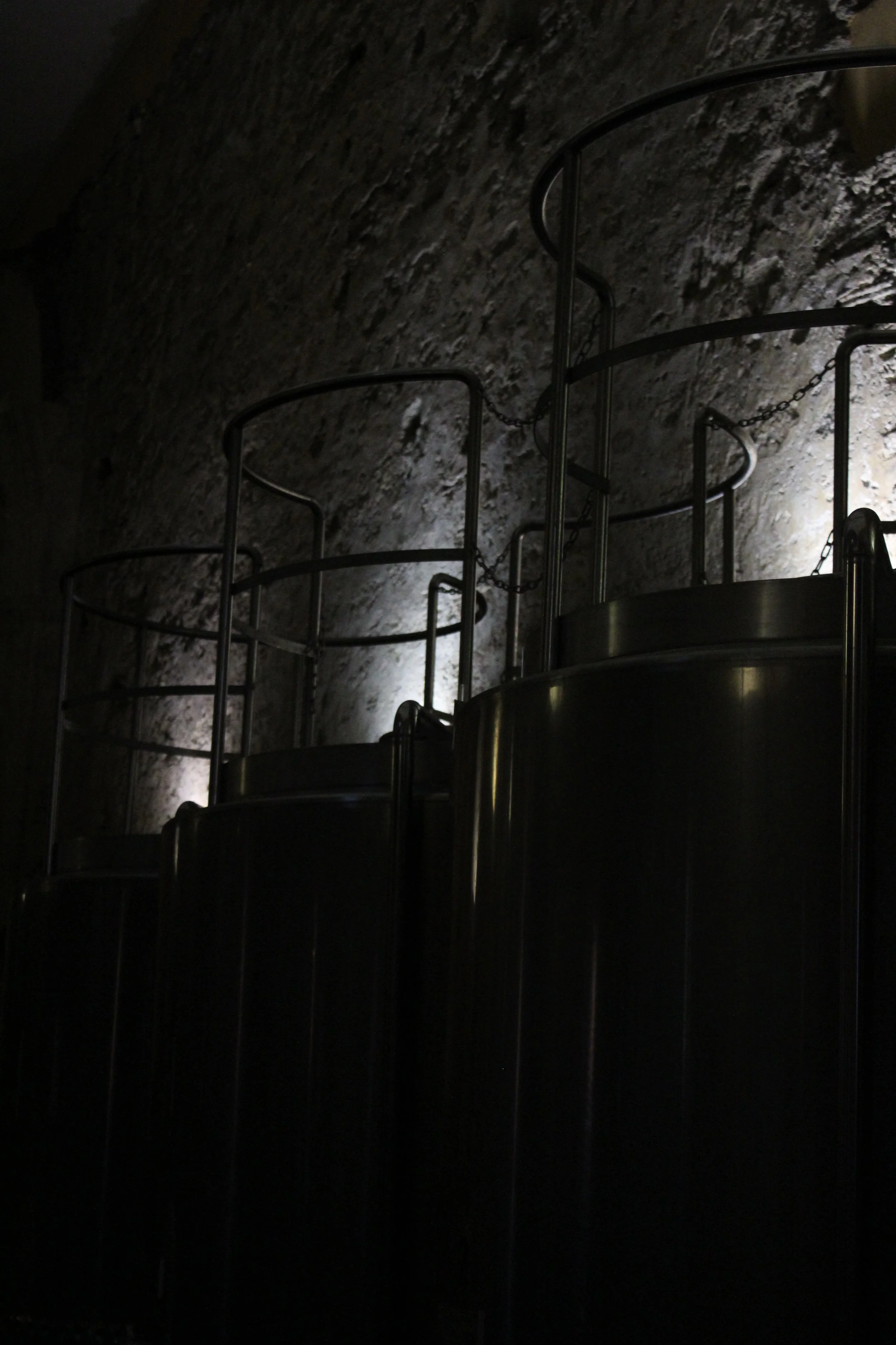
The inspiration for this wine label came directly from my visit to the winery. During the tour, we learned how the type of wood used during the aging process significantly influences the final taste of the wine. After exploring several concepts, I felt this detail was a meaningful visual anchor for the design.
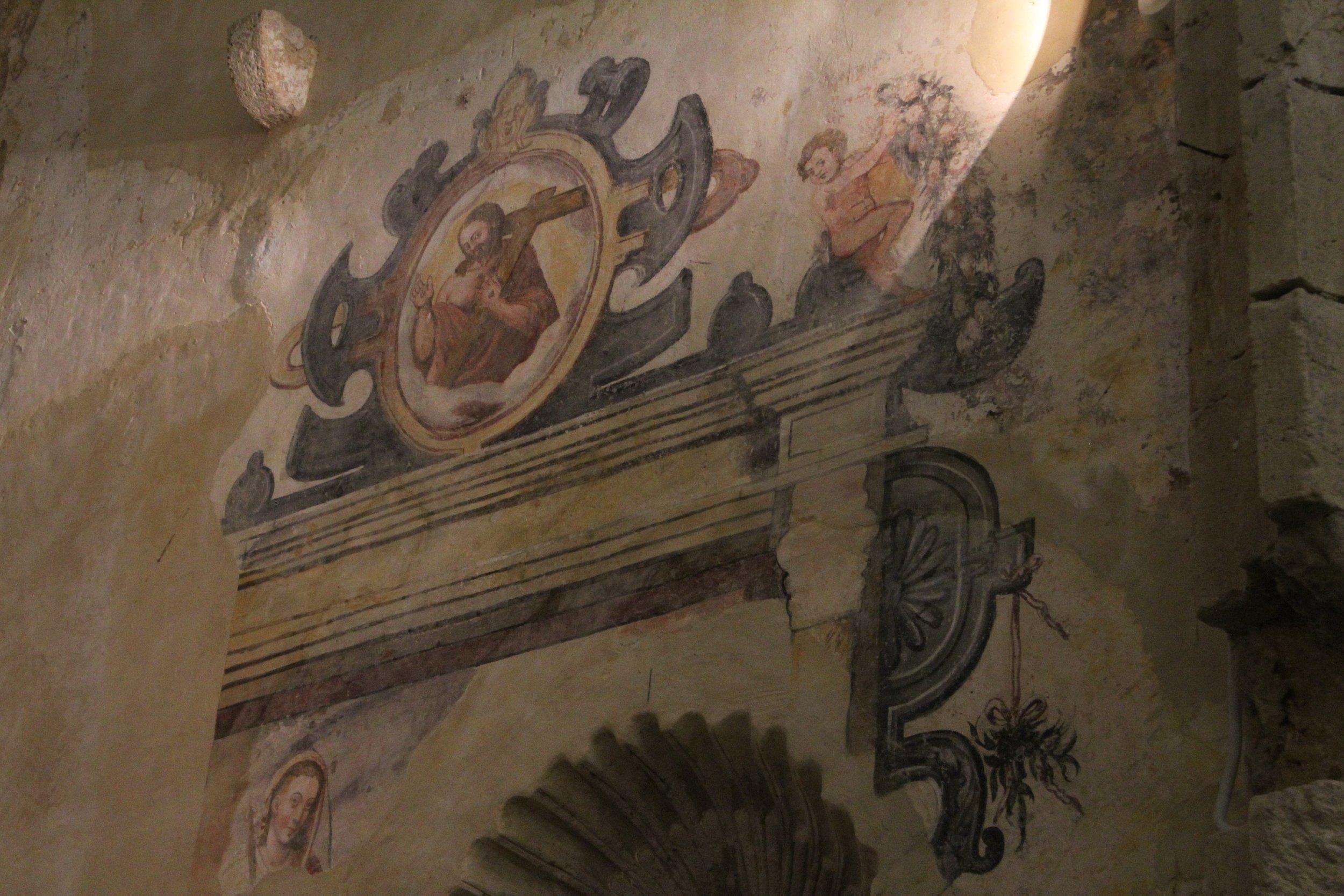
Incorporating the monastery element required me to engage with religious imagery, but given its sacred nature, I initially found it challenging to approach. This hesitation pushed me to explore alternative visual languages that respected the theme while staying true to my comfort and creative instincts.
Vectorisation
Final Chosen Logo
Logo Design
Final Logo
The final version of the logo combines the D and V into a unified symbol that instantly communicates the brand’s name at a glance.
Unlike the original, the addition of serifs introduces a traditional tone that aligns with the monastic and religious context, giving the logo a more honest and refined presence.
Label Design - Wine Bottle - Process
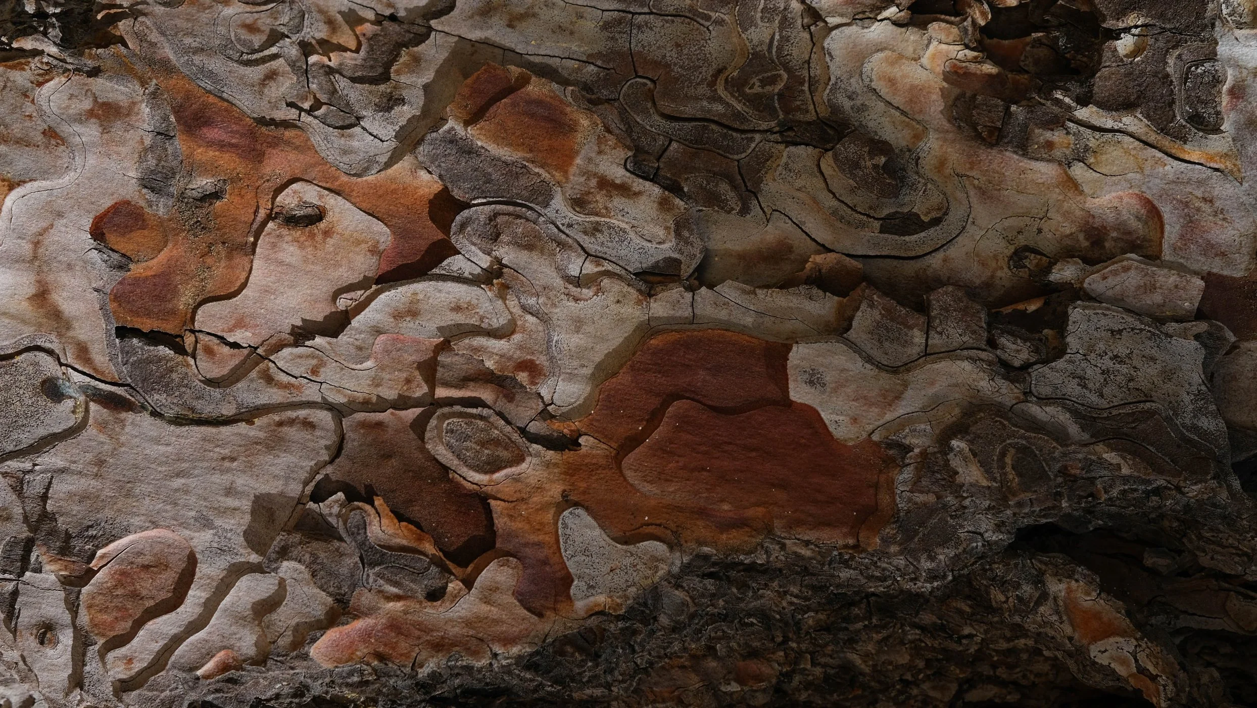
Source Image
The background of the wine label features a photograph of a tree, but digitally “liquidated” to create an abstract texture. While the wood grain is no longer distinctly recognizable, the fluid shapes and warm tones evoke the essence of wood in a liquid form. This visual treatment symbolizes the transformation that occurs during aging, the influence of the wood on the wine, bridging the natural origin with the final product in an elegant, understated way.
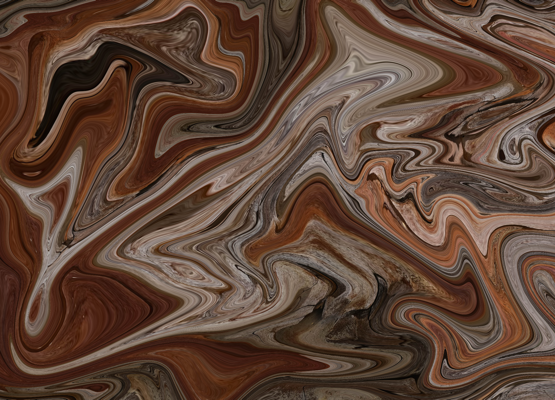
Liquidated Background
The liquid effect makes the tree harder to recognise directly, while still maintaining it’s essence.
Once the background was “liquidated,” I began placing the logo. Initially, it was centered, but since the right side of the label would carry the informational elements, the logo was shifted slightly off-center to balance the composition.

Logo Placement & Counter Label
The liquid effect makes the tree harder to recognise directly, while still maintaining it’s essence.
Once the background was “liquidated,” I began placing the logo. Initially, it was centered, but since the right side of the label would carry the informational elements, the logo was shifted slightly off-center to balance the composition.
Label Design - Wine Bottle - Final Label
Product Photography
Wine Label
Bottle Packaging
Wine Label
Creating Dielines
Since the packaging dielines had to remain true to the original, I photographed the existing packaging from above, traced the dielines, and took precise measurements to ensure the sizing was accurate.
Vectorising Dielines
Once the dielines were prepared, the final step was placing the graphic within the outline to complete the label design.
Placing Design
The final packaging design reflects the essence of the bottle label, creating a cohesive visual identity, while the back layout ensures all essential information is presented with clarity.
Product Mockups
Wine Bottle Packaging
Label Design
Olive Jar
Source Image
The image on the left acted as the foundation for the liquidation effect. Because the effect would envelop the entire image, resolution was less important than capturing a vibrant, color-rich source.
Liquidated Image
Since this is a secondary product, not directly tied to the wine’s creation, I decided to move away from the oak motif. To maintain stylistic continuity with the wine, I applied a similar liquid effect to an image of olives.
Finished Label
The completed label on the left is made up of two seperate pieces, Each measuring at 7.8cm x 10.5cm.
Label Design
Photoshoot
Marketing Collaterals
Mockups